Where do you typically encounter charts, graphs, or data in your daily life?
Do you ever track trends, such as financial markets, social media popularity, or weather patterns?
2
Watch the video carefully. Pay attention to the main ideas and key details.
Video script110 segments · click a timestamp to jump
This is a pie chart.
And this is Scottish political economist William Playfair,
who created the world's first pie chart,
along with some of the first line and bar charts.
Data visualisation is everywhere today,
but when Playfair first created them over 200 years ago,
using shapes to represent numbers was largely sneered at.
How could drawings truly represent solid scientific data?
But now data visualisation has become an art form of its own.
Here are five charts that have,
in their own way, changed the world.
One of the best known uses of data visualisation
was devised in London in 1854.
At the time, it was widely believed
that infectious diseases like cholera were spread through the air.
Surgeon John Snow felt differently.
He was convinced that infections could be spread by dirty water.
And when a deadly outbreak of cholera occurred in Soho,
Snow tracked each case and marked them with a dot on a map.
A clear picture emerged.
All the deaths from cholera
were clustered around a water pump on Broad Street.
When he presented his findings to the local officials,
the pump was shut down and the outbreak ended.
Dr John Snow fundamentally changed our understanding of microbes,
and his simple dot maps were a huge part of that.
Around about the same time,
"the lady with the lamp", Florence Nightingale,
used a cunning visual to save even more lives.
During the Crimean War,
she realised that unsanitary conditions in hospitals
were killing more soldiers than were dying on the battlefield itself.
She wanted to persuade Queen Victoria,
head of the British Army at the time,
to fund better conditions in military hospitals.
So she created the Coxcomb,
a sort of uneven pie chart
which showcased the data
on the causes of soldiers' deaths in a highly effective way.
Her efforts had sweeping impact,
not only improving the sanitary conditions
of army hospitals at the time,
but ultimately changing the face of modern healthcare.
One of the most original examples of data visualisation
was created by American historian
and civil rights activist W.E.B Du Bois
for the 1900 Paris World's Fair.
He presented a series of hand-made charts
showcasing the educational, social and business accomplishments
of black Americans in the 35 years
since slavery had been officially abolished.
The materials both challenged stereotypes
and illustrated how black communities
were still being discriminated against.
Du Bois hoped the visualisations
would help to end racial prejudice in the world.
"The problem of the 20th century
"is the problem of the color-line," he wrote.
Although his dreams weren't realised, Du Bois' beautiful charts
are now recognised as a powerful use of data visualisation
to demonstrate social change.
Data visualisation can also be used for misinformation,
sometimes with disastrous consequences.
This is the Kallikak family tree.
As a chart, it's not ground-breaking,
but its impact was profound.
It was conjured up by Henry Goddard,
an American psychologist and eugenicist
who believed that one of society's greatest problems
was "feeble-minded" people -
basically, anyone deemed to be of lower intelligence.
Goddard wrote a book based on the story of Martin Kallikak,
a soldier who was married and had a family
of fine, upstanding citizens.
But according to the book,
Martin Kallikak had a one-night stand
with a "feeble-minded" barmaid.
She had a son who became known as "Old Horror",
who went on to father ten children.
According to Goddard, feeble-mindedness was hereditary,
and the family was full of what he called
"the lowest types of human beings".
But it was a fiction.
The barmaid never existed.
Even so, the Kallikak family tree could be found in school textbooks
as late as the 1950s, and it was also used by the eugenics movement
for decades afterwards.
And it was adopted by the Nazis, who used it in propaganda films
to gain support for their racial purity laws,
which led to the murder of thousands of disabled people in the Holocaust.
Sometimes, iconic status can be achieved almost accidentally.
In 2018, scientist Ed Hawkins
was invited to give a speech about climate change at Hay,
a literary festival in Wales.
He needed to convey the increase in global average temperatures
to a largely non-scientific audience.
So, he devised a chart that used no words, just colours.
It was a stunningly simple way
of demonstrating how the planet had warmed since 1850.
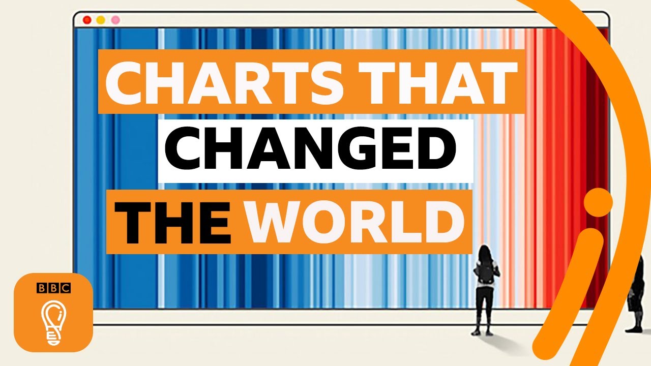
The chart, known as the warming stripes,
uses blues to indicate cooler than average years
and reds to show years with temperatures hotter than average.
Updated every year,
Hawkins says 2022 was the first year
that every country needed a new red stripe,
demonstrating how fast the Earth's climate is changing.
Although the graphic breaks some of the rules of data visualisation -
it doesn't provide a title or legend -
arguably, it is one of the most iconic graphics of modern times.
What do you think the next chart to change the world will be?
3
Answer these questions in your own words. Support your answers with evidence from the video.
01How did Dr. John Snow use data visualization to challenge the prevailing belief about how cholera spread in London?
Sample answerHe tracked each cholera case on a map, marking them with a dot. This created a clear picture showing that all the deaths were clustered around a specific water pump on Broad Street. This visual evidence helped him convince local officials that dirty water, not air, was spreading the disease, leading to the pump being shut down and the outbreak ending.
02What was Florence Nightingale's primary objective during the Crimean War, and in what way did her 'Coxcomb' chart contribute to achieving it?
Sample answerHer main objective was to persuade Queen Victoria to fund better conditions in military hospitals, as she realized unsanitary environments were killing more soldiers than battlefield injuries. Her 'Coxcomb' chart effectively showcased data on the causes of soldiers' deaths, making a powerful visual argument that ultimately led to improved sanitary conditions and changed modern healthcare.
03The video presents W.E.B. Du Bois's charts and the Kallikak family tree. In what significant way did the purpose and impact of these two visualisations differ, despite both using data?
Sample answerDu Bois's charts were created to challenge racial stereotypes and highlight the accomplishments of black Americans, aiming to end racial prejudice and demonstrate social change. In stark contrast, the Kallikak family tree was a fabricated chart used to promote eugenics and 'feeble-mindedness,' leading to misinformation, support for racial purity laws, and ultimately the murder of thousands of disabled people in the Holocaust. One sought justice, the other caused immense harm.
04Ed Hawkins's 'warming stripes' chart is described as iconic even though it 'breaks some of the rules of data visualisation.' What makes it so effective and iconic, particularly for a non-scientific audience?
Sample answerIt's considered iconic because of its stunning simplicity and directness. It uses no words, just colours – blues for cooler years and reds for hotter years – to visually represent the increase in global average temperatures since 1850. This allows a largely non-scientific audience to immediately grasp the speed and scale of climate change, making it incredibly powerful and memorable despite lacking a title or legend.
4
Decide if each statement is true or false. Correct the false ones.
01Initially, William Playfair's groundbreaking work in data visualisation, which introduced the first pie and bar charts, was widely celebrated by the scientific community for its clarity.
02W.E.B. Du Bois's charts, presented at the 1900 Paris World's Fair, aimed to highlight the significant educational and business accomplishments of black Americans in the decades following the abolition of slavery.
03The Kallikak family tree, a chart widely adopted in school textbooks, was based on a thoroughly documented study of a real family, providing compelling evidence for the hereditary nature of 'feeble-mindedness'.
04Ed Hawkins's 'warming stripes' chart effectively conveys global temperature trends by using blue stripes to represent cooler-than-average years and red stripes for hotter-than-average years.
05Florence Nightingale's 'Coxcomb' chart played a crucial role in demonstrating that unsanitary conditions in military hospitals were responsible for more soldier deaths than direct combat during the Crimean War.
5
Vocabulary
Vocabulary
These expressions will help you communicate more naturally about this topic.
Examples
level off — to stop increasing or decreasing and remain stable at a particular level.
Usage note: This phrasal verb is often used to describe data points on a chart, such as sales, prices, or growth rates, reaching a plateau.
bear in mind — to remember or consider an important fact or point when you are thinking about something.
Usage note: This phrase is useful for reminding someone of a crucial detail or context when discussing data or making a decision. For example: 'We need to bear in mind the seasonal variations.'
key takeaway — the most important piece of information, message, or lesson that you learn or take from something like a presentation, report, or discussion.
Usage note: Use this phrase when you want to summarise the main conclusion or most significant finding from a set of data or an analysis.
an upward/downward trend — a general direction in which something is developing or changing, either increasing (upward) or decreasing (downward) over time.
Usage note: This common collocation helps describe the overall movement of data on a chart. You can 'observe', 'see', or 'identify' a trend.
project figures — to estimate or calculate future amounts or numbers based on current data, past performance, and assumptions.
Usage note: This phrase is frequently used in business and finance when discussing forecasts for sales, profits, or economic growth. For example: 'The company projects figures for next quarter.'
6
Discussing data and trends
Match the beginning of each sentence or phrase with its correct ending to form a complete statement about data, charts, and finance.
Match each item on the left with the correct item on the right.
A
B
7
Match each word on the left with its natural partner on the right.
A
B
8
Words to take with you
Vocabulary
These expressions are not in the video but will help you discuss this topic more fluently.
Examples
to fluctuate — to rise and fall irregularly in number or amount.
Use this verb to describe data that is not stable but moves up and down. For example, "Stock prices often fluctuate throughout the day," or "The temperature in this region can fluctuate wildly."
to account for — to form a particular amount or proportion of something, or to explain the reason for something.
This phrasal verb is very useful when discussing what percentage a category makes up in a total, or when explaining why something happened. For example, "Sales in Asia now account for 40% of our global revenue," or "Poor marketing can account for the low engagement rates."
to take into account — to consider particular facts, circumstances, or factors when making a decision or judgment.
Use this phrase when you need to mention that certain information or conditions must be considered during analysis or planning. For example, "When forecasting next year's budget, we need to take into account potential inflation," or "The report didn't take into account the impact of the new competitor."
to paint a (clear/grim/rosy) picture — to describe or represent a situation in a particular way, often used with adjectives like 'clear', 'grim' (bad), or 'rosy' (good).
This idiomatic expression is excellent for summarizing what data or a report reveals about a situation. For example, "The latest economic data paints a grim picture for small businesses," or "Our Q4 results paint a rosy picture for the company's future."
to be on track — making progress and likely to achieve a goal or target.
This phrase is commonly used in business and finance to indicate that current performance suggests a desired outcome will be reached. For example, "If sales continue at this rate, we're on track to hit our annual targets," or "Are we still on track to launch the product next month?"
9
Use the word in brackets to form a new word that fits each gap.
01
The latest financial indicate a strong recovery in the market.
02
After months of volatility, the market showed signs of as prices stabilised.
03
The latest report highlights a significant in online sales compared to last year.
04
When interpreting the data, it's important to take the sample size into .
05
The most point from the CEO's presentation was the need for immediate cost-cutting measures.
06
To make informed decisions, it's crucial to conduct a thorough of all available data.
10
Grammar: Future continuous and future perfect
Grammar
The future continuous tense describes actions that will be in progress at a specific time in the future, often used for ongoing trends or planned activities. The future perfect tense describes actions that will be completed by a specific point in the future, useful for setting targets or forecasting achievements in finance and data analysis.
Examples
By the end of this fiscal year, we will have compiled all the sales data for the annual report.
Future perfect: 'will have compiled' indicates an action completed before a future deadline.
Analysts predict that the market will still be experiencing high volatility throughout the next quarter.
Future continuous: 'will be experiencing' describes an ongoing trend at a future point.
If current trends persist, we will have exceeded our growth targets by the time the new CEO takes over.
Future perfect: 'will have exceeded' shows a completed achievement before a future event.
Key points
Use the future continuous (will be + -ing verb) for actions that will be in progress at a specific future time or for ongoing trends.
Use the future perfect (will have + past participle) for actions that will be completed before a specific future time or for future achievements/milestones.
Common time expressions include 'by next month/year', 'by the time...', 'this time next week', 'in five years', which help specify the future point.
11
Rewrite each sentence using the future perfect tense and the structure indicated.
01The financial department will estimate the company's earnings for the next fiscal year by December.
Rewrite the sentence using the future perfect tense and the phrase 'project figures'.
Hint: Remember the structure: will have + past participle.
02Analysts expect the stock market to show a positive direction by the end of the year.
Rewrite the sentence using the future perfect tense and the phrase 'an upward trend'.
Hint: Focus on the action completed by a future point.
03Inflation is expected to stabilize at 3% by the middle of next year.
Rewrite the sentence using the future perfect tense and the phrasal verb 'level off'.
Hint: Think about how 'level off' fits into the future perfect structure.
04The team will understand the most important points from the data analysis by the end of the meeting.
Rewrite the sentence using the future perfect tense and the phrase 'key takeaway'.
Hint: Consider what action will be completed regarding the 'key takeaway'.
05It's crucial to remember all the potential risks before making a final investment decision.
Rewrite the sentence using the future perfect tense and the idiom 'bear in mind'.
Hint: The past participle of 'bear' is 'borne'.
06The company plans to complete the annual financial review by the end of the quarter.
Rewrite the sentence using the future perfect tense.
Hint: Identify the action that will be finished by the quarter's end.
12
Correcting errors in data discussions
Read each sentence carefully. Each one contains a single error related to grammar, vocabulary, or usage when discussing charts and data. Identify the error and provide the correct sentence.
Each sentence contains one error. Find and correct it.
01After a sharp increase, the sales figures are expected to level of around 500 units next quarter.
Corrected version
After a sharp increase, the sales figures are expected to level of off around 500 units next quarter.
02When analyzing the Q3 report, you should bearing in mind the seasonal fluctuations.
Corrected version
When analyzing the Q3 report, you should bearing bear in mind the seasonal fluctuations.
03The key take away of this chart is that customer satisfaction has significantly improved.
Corrected version
The key take away takeaway of this chart is that customer satisfaction has significantly improved.
04By next quarter, we will seeing a clear upward trend in market share, according to our projections.
Corrected version
By next quarter, we will be seeing a clear upward trend in market share, according to our projections.
05By the next board meeting, we will have projecting the sales figures for the upcoming quarter.
Corrected version
By the next board meeting, we will have projecting projected the sales figures for the upcoming quarter.
06The latest report points out to a significant shift in consumer preferences.
Corrected version
The latest report points out to a significant shift in consumer preferences.
07The data clearly indicates a positive affect on our customer retention rates.
Corrected version
The data clearly indicates a positive affect effect on our customer retention rates.
08It's important to take into account every variables when interpreting complex financial charts.
Corrected version
It's important to take into account every all variables when interpreting complex financial charts.
13
Useful phrases: Discussing data and trends in a business meeting
Vocabulary
In professional settings, being able to confidently discuss data, charts, and financial trends is a vital skill. These phrases will help you present information clearly, interpret findings, and contribute effectively to discussions about performance and future projections.
Examples
''Let's take a look at these figures for the last quarter.'' — This phrase is used to introduce a chart, graph, or set of numbers that you want to discuss.
Register: Neutral. Use this at the beginning of a presentation or when shifting focus to data during a meeting.
''As you can see, there's a clear upward trend in sales.'' — This describes a general direction of increase in data over time. You can also use 'downward trend' for a decrease.
Register: Neutral. Useful for summarising the main movement shown in a chart. 'A significant upward/downward trend' adds emphasis.
''The key takeaway here is that our marketing efforts are paying off.'' — This highlights the most important piece of information or conclusion drawn from the data.
Register: Neutral. Use this to summarise the main point or lesson learned after presenting detailed data. It helps focus the audience.
''It looks like the numbers are starting to level off after a period of rapid growth.'' — This indicates that data, which was previously increasing or decreasing, is now becoming stable.
Register: Neutral. Use this when describing a plateau in data, suggesting stability or a slowdown in change. 'To level out' is a common synonym.
''Based on these projections, we expect figures to reach 1.5 million by year-end.'' — This phrase is used to talk about estimated future numbers or amounts.
Register: Neutral. Use this when discussing forecasts or predictions based on current data and analysis. You can also say 'we project that figures will...'
''It's crucial to bear in mind that these figures don't account for seasonal variations.'' — This advises listeners to remember an important fact or consideration when interpreting the data.
Register: Neutral. Use this to introduce a caveat or an important factor that needs to be considered alongside the presented data, adding nuance to the discussion.
14
Complete the sentences with words from the box. One word is extra.
Word bank
01After a period of rapid growth, sales are expected to in the next quarter.
02When analyzing the quarterly report, we must that seasonal factors often influence these numbers.
03The most important from the presentation was that customer satisfaction has significantly improved.
04Despite some fluctuations, the overall for online subscriptions has been positive this year.
05Based on current performance, analysts that the company will exceed its revenue targets.
15
Discussing data and financial trends
Understanding how to analyze data and charts is a vital skill in many fields, especially in finance. This exercise focuses on key phrases and expressions used to describe trends and make predictions.
Fill in each blank with the correct word or phrase from the word bank.
Word bank
Understanding how to financial charts is crucial for making informed decisions. When analyzing market performance, it's important to identify whether there's in sales or if demand is starting to . Analysts often for the next quarter based on current data, but we must always that unforeseen events can impact these predictions. Sometimes, after a period of rapid growth, sales might before declining. The from any data presentation should always be a clear, actionable insight.
This lesson is for Lessonpills members
Sign in at learn.lessonpills.com to print lessons or save them as PDF.